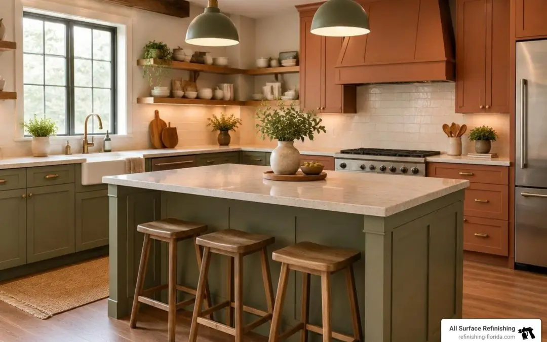
Top Trending Kitchen Cabinet Color Ideas for 2026
Kitchen design has moved away from sterile, showroom-style all-white palettes. Today, homeowners are seeking warmth, character, and visual depth. Because cabinetry occupies roughly 40% of the visual space in an average kitchen, changing its shade transforms the entire atmosphere of your home.
Whether you want a calm coastal feel or dramatic contrast, design pros are focusing on rich earth tones, livable neutrals, and mood-setting statement shades. Leading design forecasts highlight how intentional palettes create welcoming spaces that stand the test of time, as seen in publications like Good Housekeeping and Brit + Co.
Warm Whites and Soft Creams as Timeless Kitchen Cabinet Color Ideas
While cold, hospital-grade whites are fading out, warm whites and soft creams continue to be volume leaders across residential kitchens. Shades with creamy, yellow, or beige undertones soften harsh overhead light and prevent spaces from feeling clinical.
- Light Reflectance Value (LRV): Choosing off-whites with an LRV between 80 and 85 keeps your space bright and open while hiding daily fingerprints far better than stark white.
- Versatility: Warm creams pair effortlessly with natural stone countertops, warm travertine tile, and rich hardwood or luxury vinyl flooring.
- Hardware Pairings: Unlacquered brass, brushed bronze, and matte black hardware complement soft cream cabinetry, creating an inviting, transitional aesthetic.
Nature-Inspired Greens: Sage, Olive, and Smoky Jade
Muted green is one of the fastest-growing color categories for modern cooking spaces. Greens bridge traditional Shaker cabinetry with modern flat-panel designs, bringing the calming effect of the outdoors inside.
- Soft Sage: A subtle, low-risk green that functions almost like a neutral. It reflects ample natural light and pairs beautifully with white quartz countertops.
- Rich Olive: Adds an organic, grounded feel to larger kitchens. Olive works exceptionally well when balanced by warm wood open shelving.
- Smoky Jade: A trending blue-green shade that offers a sophisticated focal point for perimeter cabinetry or dedicated bar areas.
Deep Moody Tones: Navy, Charcoal, and Plum
For homeowners who want bold sophistication, deep saturated colors deliver high-end impact. Dark shades ground high-ceiling rooms and add instant luxury when applied thoughtfully.
- Classic Navy: A timeless favorite that delivers rich contrast against bright countertops and subway tile backsplashes.
- Velvety Charcoal: An elegant alternative to pure black, charcoal brings depth without casting an overly harsh shadow in modern cooking spaces.
- Muted Plum and Oxblood: Rising design favorites that add regal, vintage-inspired warmth to kitchen islands and lower cabinetry runs.
Earthy Neutrals and Taupe Kitchen Cabinet Color Ideas
If you want color without straying into vibrant blues or greens, earthy neutrals offer the ideal middle ground. Warm greige, mushroom, and taupe provide subtle depth while remaining completely versatile.
- Greige & Taupe: These shades shift dynamically throughout the day, looking warm in the morning sun and grounded under evening pendant lighting.
- Natural Texture Pairing: Earthy neutrals harmonize seamlessly with fluted millwork, butcher block accents, and warm-veined marble slabs.
- Longevity: A neutral backdrop allows you to swap out seasonal decor, runner rugs, and barstools without worrying about clashing undertones.
Two-Tone Cabinet Layouts and Color Combinations

Two-tone cabinetry remains one of the most requested design layouts because it offers the perfect balance of openness and visual weight. By splitting colors across your kitchen, you can enjoy rich, moody hues without making the cooking space feel small or dim.
To ensure your two-tone kitchen looks cohesive rather than chaotic, follow the 60-30-10 design rule:
- 60% Dominant Neutral: Use your lightest color on perimeter upper cabinets or all upper/lower wall runs to maintain an open, airy baseline.
- 30% Grounding Shade: Apply your deeper accent hue to the kitchen island base or all lower perimeter cabinetry.
- 10% Accent Metallic/Wood: Pull the entire room together with matching hardware, decorative light fixtures, and natural wood barstools.
| Upper / Perimeter Cabinet Color | Lower / Island Cabinet Color | Contrast Level | Best Suited Kitchen Style |
|---|---|---|---|
| Warm White (LRV 82–85) | Deep Navy | High Contrast | Coastal, Transitional, Classic |
| Soft Cream | Muted Sage Green | Soft / Subtle | Organic Modern, Cottage, Farmhouse |
| Light Greige | Rich Olive or Forest Green | Medium Contrast | Contemporary, Earthy Modern |
| Bright Warm White | Charcoal or Matte Black | Bold Contrast | Modern Industrial, Urban Minimalist |
| Alabaster / Off-White | Stained Walnut / Deep Taupe | Warm Contrast | Mid-Century Modern, Transitional |
Pro Tip: When choosing two-tone combinations, aim for an LRV difference of at least 15 to 20 points between your upper and lower shades. If the two colors are too close in tone, the kitchen can look like a color-matching mistake rather than an intentional design choice.
How to Choose the Perfect Cabinet Color for Your Lighting and Layout
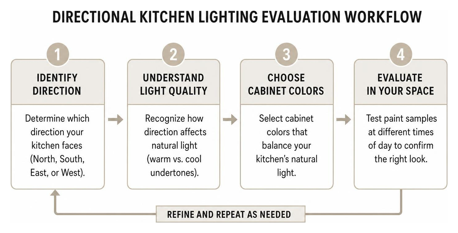
Cabinet colors never exist in a vacuum. The exact same paint swatch can look warm and cozy in one home but dull and icy in another. Evaluating your room’s natural lighting exposure and physical layout is essential before making a permanent decision.
Factoring in Directional Sunlight
- North-Facing Kitchens: Natural light from the north tends to have a cool, bluish tint. Cool grays or stark whites can make these kitchens feel chilly. Balance cool light by selecting warm whites, soft creams, or yellow-undertone greiges.
- South-Facing Kitchens: Southern exposure floods spaces with intense, golden light all day long. This warm light amplifies yellow and red undertones. Cool tones, slate blues, crisp whites, and muted sage greens thrive in south-facing rooms.
- East & West Exposures: East-facing rooms receive warm morning sun followed by cooler afternoon light, while west-facing kitchens experience warm late-afternoon glares. Test your color swatches during both morning breakfast and evening prep hours.
Adapting to Kitchen Footprints
In compact or narrow galley kitchens, darker cabinets can absorb light and create a closed-in feeling. Keep upper cabinetry light to draw the eye upward and preserve a sense of space. In vast, open-concept floor plans, deep charcoal, navy, or rich green cabinetry helps anchor the kitchen zone so it doesn’t get lost in the surrounding living areas.
Harmonizing with Fixed Finishes
Always audit your unchangeable fixed elements—countertops, backsplash tile, and flooring:
- Warm Granite & Travertine: Pair with soft creams, warm taupes, or olive tones to maintain an earthy harmony.
- Cool Gray Quartz & Carrara Marble: Complement with crisp off-whites, slate blues, or bold charcoal bases.
- Golden or Honey-Toned Flooring: Deep navy and smoky jade create a gorgeous complementary contrast against warm wood floors.
Selecting the Right Finish and Sheen for Long-Lasting Durability
Choosing the right color is only half the battle; selecting the proper coating formulation and sheen level ensures your investment lasts through years of daily cooking, spills, and cleaning. Kitchen cabinets endure steam, grease splatters, and continuous hand contact, making standard wall coatings unsuitable for cabinetry surfaces.
Professional refinishing utilizes specialized bonding primers and durable factory-grade topcoats rather than standard architectural paint. While DIY brush-and-roller projects often leave visible streaks and peel under heavy use, our professional spray applications provide a mirror-smooth, rock-hard cure that resists chipping and moisture intrusion.
Frequently Asked Questions About Kitchen Cabinet Colors
What is the most popular kitchen cabinet color in 2026?
Warm white and soft cream remain the most popular kitchen cabinet colors overall due to their timeless appeal and strong resale value. However, muted sage green and warm taupe are the fastest-growing accent choices for islands and lower cabinets.
Should kitchen cabinets be lighter or darker than the walls?
In most kitchens, cabinets look best when they are slightly darker or lighter than the walls to establish clear visual boundaries. If your walls are a light warm neutral, choosing a colored or deeper cabinet shade creates depth. If you prefer white cabinetry, painting the walls a shade or two deeper ensures your cabinets pop.
What coating sheen is best for kitchen cabinets?
Satin and semi-gloss sheens are the industry standards for kitchen cabinetry. Satin offers a contemporary, low-luster appearance that conceals minor surface imperfections, while semi-gloss provides the highest level of moisture resistance and effortless wipe-down cleaning.
Transform Your Kitchen with All Surface Refinishing
You don’t need to spend tens of thousands of dollars on full cabinet teardowns to achieve the kitchen of your dreams. Our team at All Surface Refinishing brings over 30 years of experience and more than 14,000 completed projects to every home transformation. We specialize in fast, cost-effective, and high-quality resurfacing for kitchen cabinets, countertops, bathtubs, and tile.
Whether you are looking to brighten a coastal kitchen in Boca Raton, introduce rich olive tones in Fort Lauderdale, or modernize your cooking space in Delray Beach, Palm Beach Gardens, or Coral Gables, we deliver factory-grade, flawless finishes that last. We do not sell paint—we provide complete, specialized refinishing solutions engineered for ultimate durability.
Ready to bring your favorite color ideas to life? Explore our professional cabinet color change service today to request your free consultation and quote!
