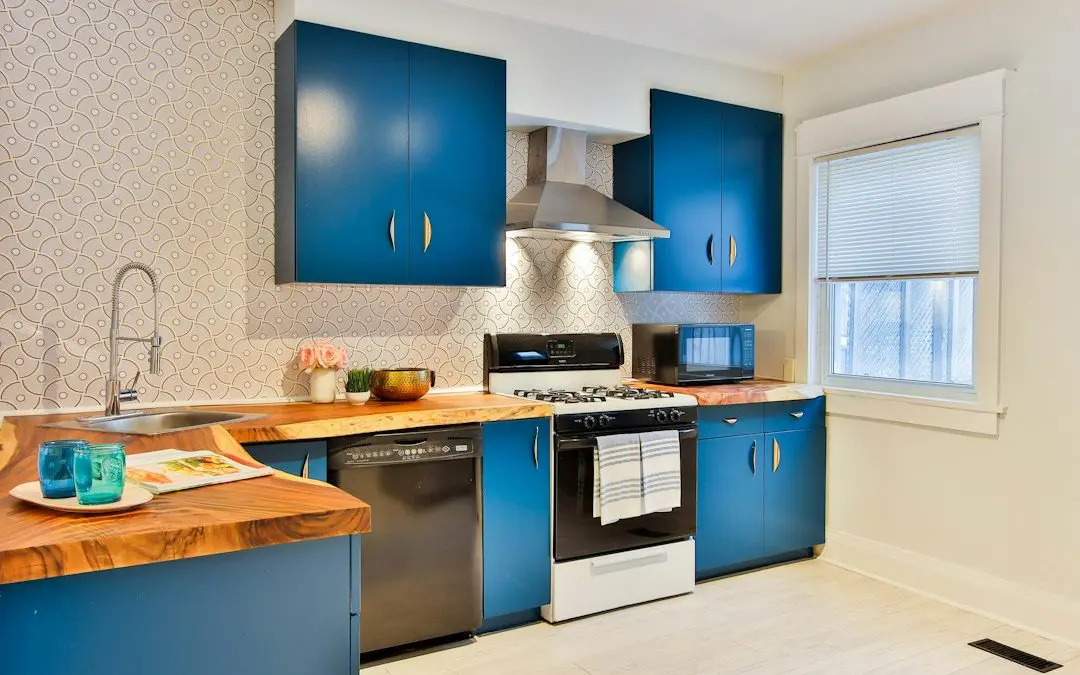
Why 2 Tone Kitchen Cabinets Create a Custom Kitchen Look
2 tone kitchen cabinets use two cabinet colors, finishes, or materials in one kitchen. The most reliable approach is light upper cabinets with a darker lower run or island. This keeps the kitchen bright, adds depth, and helps hide everyday scuffs on busy base cabinets.
For a polished result:
- Choose one neutral anchor, such as warm white, cream, greige, or natural wood.
- Add one darker or richer accent, such as navy, sage green, charcoal, walnut, or black.
- Keep the cabinet door style and most hardware consistent across both tones.
- Test samples in your kitchen during the day and at night before making a final choice.
Unlike single-color cabinets, a two-tone design creates visual layers. It can make a small kitchen feel more open when light colors stay above eye level, or define the kitchen area in an open-plan home when a contrasting island becomes the focal point. The goal is not simply contrast. It is balance between the cabinet colors, countertop, backsplash, flooring, and light.
I’m Frank Hernandez, President of All Surface Refinishing, and I have worked in surface refinishing for more than a decade while serving South Florida property owners since 1996 through our combined company experience. In this guide, I’ll share practical ways to plan durable, well-balanced 2 tone kitchen cabinets that update an outdated kitchen without the disruption of full replacement.
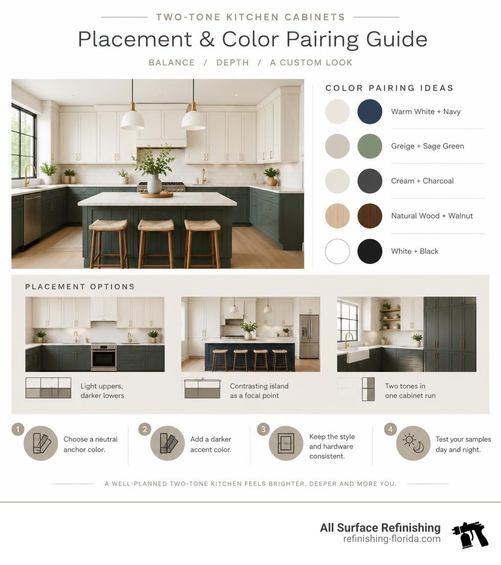
Basic 2 tone kitchen cabinets vocab:
Designing 2 Tone Kitchen Cabinets for Maximum Visual Impact

When designing a two-tone layout, the way you distribute color directly impacts how open, tall, and balanced the room feels. Rather than scattering shades randomly, top designers use structured layout strategies to establish focal points and manipulate spatial perception.
Whether you are looking to lift low ceilings or create an architectural anchor in a vast, open living area, your cabinetry layout dictates the kitchen’s visual hierarchy.
The Tuxedo Layout: Upper vs. Lower Split
The upper versus lower split—commonly known as the tuxedo kitchen—is the most enduring two-tone layout. In this configuration, wall cabinets are coated in a lighter hue (such as soft white or light greige), while the base cabinets take on a darker, richer tone like navy, deep charcoal, or rich wood stain.
This design functions on a simple visual principle: darker colors carry more visual weight. By placing darker finishes on base cabinets, you anchor the room to the flooring. Lighter wall cabinets reflect ambient light toward the ceiling, creating an optical illusion that makes ceilings seem higher and narrow spaces feel wider.
As a practical bonus for busy families, darker base cabinetry hides shoe scuffs, pet smudges, and cooking spills far better than all-white bases.
The Island Accent Strategy
If you love your current perimeter cabinets or prefer a softer contrast, turning the kitchen island into a secondary tone is an ideal choice. In this setup, the entire perimeter remains a cohesive neutral, while the central island receives a contrasting shade.
This layout works exceptionally well in open-concept floor plans common throughout South Florida homes. The island serves as the visual centerpiece that bridges the kitchen with surrounding dining or living areas. Using a rich jewel tone, deep navy, or natural oak on an island creates a statement piece without overwhelming the entire space.
Vertical and Functional Zoning
Vertical zoning uses color to define specific task zones or architectural features within the room. Instead of splitting horizontally, you assign a secondary color to dedicated sections such as:
- Built-in coffee bars or beverage stations
- Floor-to-ceiling pantry walls
- Built-in display hutches or appliance garages
By giving an accent zone a distinct hue, you add bespoke architectural character that feels tailored to your daily routine.
Trending Color Combinations and Material Pairings

Selecting colors requires considering both Light Reflectance Value (LRV) and undertone temperature. LRV measures the percentage of light a color reflects on a scale from 0 (absolute black) to 100 (pure white). For a crisp, intentional two-tone look, designers recommend maintaining an LRV gap of at least 30 points between your light and dark choices.
Before finalizing selections, explore expert color testing recommendations to see how shifting morning and evening light affects contrasting paints in your home.
| Upper / Perimeter Color | Base / Accent Color | Visual Effect | Style Category |
|---|---|---|---|
| Soft Off-White (LRV ~82) | Deep Indigo Navy (LRV ~8) | Crisp, nautical, grounding | Transitional |
| Warm Cream (LRV ~74) | Smoky Jade / Olive (LRV ~15) | Organic, calming, earthy | Nature-Inspired |
| Crisp White (LRV ~85) | Natural White Oak / Walnut | Warm, rich, textured | Organic Modern |
| Light Greige (LRV ~60) | Matte Charcoal (LRV ~10) | Sophisticated, understated | Contemporary |
| Alabaster White (LRV ~82) | Pitch Black (LRV ~4) | High drama, modern contrast | Modern Tuxedo |
Classic Color Pairings for 2 Tone Kitchen Cabinets
Timeless combinations rely on balanced neutrals paired with deep, universally appealing accents. Soft whites paired with deep navy blue, charcoal gray, or warm greige have remained designer favorites for years.
If you are exploring dark cabinetry bases, taking time to compare black kitchen cupboard styles will help you determine whether deep charcoal, soft graphite, or true matte black pairs best with your countertops.
Earthy Greens and Natural Wood Tones
Nature-inspired palettes have surged in popularity. Soft sage, eucalyptus, and deep forest greens pair beautifully with natural wood finishes like white oak or walnut.
Combining painted uppers with warm wood-grain lower cabinets introduces organic texture that prevents modern kitchens from feeling sterile or uninviting.
High-Contrast Modern Statements
For modern interiors, high-contrast combinations create immediate visual drama. Pairing crisp, bright white wall cabinets with rich emerald green, moody black, or deep plum lower runs makes an unmistakable design statement.
To ensure the space feels elevated rather than harsh, explore modern cabinet looks featuring sleek flat-panel profiles and soft, non-reflective surfaces.
Hardware, Finishes, and Common Design Mistakes to Avoid
Cabinet hardware acts as the visual thread that stitches two distinct colors into a cohesive whole. When you change cabinet colors across upper and lower runs, using a uniform hardware finish ensures the design feels deliberate rather than disjointed.
To understand professional surface prep and finish durability, review this complete guide to cabinet painting services.
How to Choose Finishes for 2 Tone Kitchen Cabinets
The sheen of your cabinetry finish affects both light reflection and everyday durability:
- Satin Finish: Offers a soft, pearl-like luster with excellent washability. Ideal for both upper and lower runs.
- Semi-Gloss: Provides enhanced moisture resistance and subtle shine, making it popular for high-traffic base cabinets.
- Matte/Eggshell: Delivers a contemporary designer look, though it requires premium urethane topcoats to resist kitchen grease and scuffs.
To discover the technical steps behind achieving a flawless factory finish, read our advice on how to change kitchen cabinet color like a pro.
Common Pitfalls: Undertone Clashes and Overcomplication
The most frequent design mistake is mixing clashing undertones. Pairing a cool, blue-toned white upper cabinet with a warm, yellow-toned beige lower cabinet creates visual friction that makes the lighter paint look dirty. Always pair warm undertones with warm accents, and cool tones with cool accents.
Another common pitfall is overcomplicating the palette. Follow the 70/30 rule: dedicate approximately 70% of your visible cabinet surface to your dominant neutral, reserving 30% for your bold accent color.
Ensure your countertops and backsplash bridge the two cabinet colors rather than introducing competing patterns.
Costs, Resale Value, and Transformation Methods
A well-executed two-tone cabinet upgrade provides strong returns by giving the kitchen a custom, high-end appearance without the steep cost of a complete demolition. Prospective home buyers respond enthusiastically to tasteful two-tone designs featuring neutral perimeters and rich wood or navy islands.
For homeowners evaluating their remodel scope, our comprehensive cabinet refinishing guide outlines the longevity and value of professional surface restoration.
Painting and Refinishing vs. Other Renovation Methods
Tearing out existing cabinetry often costs upwards of $20,000 to $40,000 and leaves your kitchen unusable for weeks. By opting for professional refinishing and specialized coatings, you preserve your solid structural boxes while completely transforming the aesthetics.
Choosing a professional cabinet color change service allows you to select custom factory-grade colors for your upper and lower cabinets at a fraction of replacement costs.
You can easily give your kitchen a facelift by changing cabinet color in just a few days, keeping project timelines short and manageable. We provide specialized surface coating and spray application services rather than retail paint sales.
Frequently Asked Questions About Two-Tone Kitchens
Do two-tone cabinets make a kitchen look bigger or smaller?
When executed properly, two-tone cabinets make a kitchen feel larger. Using light colors on upper wall cabinets reflects natural light and draws the eye upward, giving the illusion of higher ceilings. Meanwhile, darker base cabinets provide grounding depth without closing in your sightlines.
Should the upper or lower cabinets be darker in a two-tone kitchen?
In almost every scenario, the lower cabinets should be darker. Placing darker shades on bottom anchors the room, conceals everyday floor-level scuffs, and prevents the space from feeling top-heavy. Darker uppers are generally reserved for spaces with exceptionally tall ceilings where visual intimacy is desired.
Are two-tone kitchen cabinets still in style for 2026?
Yes, two-tone cabinetry remains one of the leading interior design trends in 2026. The trend has shifted away from stark, clinical contrasts toward organic modern pairings—such as warm whites matched with natural oak, rich walnut, or muted earthy greens.
Conclusion
Upgrading to two-tone cabinetry is an exceptional way to bring depth, character, and custom style to the heart of your home. By thoughtfully balancing light uppers with rich lower accents, matching your undertones, and selecting durable professional finishes, you can achieve a designer kitchen that stands the test of time.
At All Surface Refinishing, we bring over 30 years of industry experience and more than 14,000 successful projects across South Florida. Whether you are located in Boca Raton, Fort Lauderdale, West Palm Beach, Coral Gables, Palm Beach Gardens, Jupiter, or Boynton Beach, our skilled team is ready to deliver a fast, high-quality, and cost-effective transformation.
Contact us today to schedule your personalized consultation and discover how our cabinet refinishing and painting services can turn your kitchen into the showpiece you have always wanted.
